

There is plenty of good advice in the research methodology literature, which aims to help you with the content of a questionnaire. What is perhaps less common is advice on the production of the actual questionnaire document. In this post, I have put together a few tips and tricks that my students and I have found particularly useful. The topics that we will look at are:
- How long a questionnaire should be
- What information should be included in the questionnaire
- How to use typography effectively
- How to make attractive questionnaire booklets
Before we begin
When writing this post, I made the following assumptions about you. I presume that you already know how to write effective questionnaire questions. If that is not yet the case, you can read the following posts:
You may also want to read Chapter 20 in Cohen, Manion and Morisson’s Research Methods in Education, or Dörnyei’s Questionnaires in Second Language Research.
I also assume that you have decided to use a pen-and-pencil research instrument, as opposed to an online survey. Some of the content, of course, would apply to online surveys as well.
How long should the questionnaire be?
In order to answer your research questions, more data is always better. However, in my experience, questionnaires that take more than about 30 minutes to complete are problematic, because they generate respondent fatigue. In addition, taking up more of the respondents’ time is also ethically questionable, unless respondents are invested in the topic, or you have provided a suitable incentive or compensation.
You can get an estimate of how many questions can be answered within the 30-minute timeframe by piloting the questionnaire. As a rule of thumb, 4-6 pages is a reasonable length for a questionnaire that mostly consists of closed-response factual questions. Of course, you will need to adjust this number, depending on the type of questions you ask, and factors such as the respondents’ age, reading comprehension skills etc.
If you need more data than can be accommodated in a 4-6 page questionnaire, it is a very bad idea to try to cram more items by using smaller fonts or margins. Such tricks will only make the questionnaire less reader-friendly, and respondents will likely be discouraged from completing it.
What content do you need?
Of course, the questionnaire document should contain the questions that you want participants to answer. But here are some more things that you may want to think about:
Consent
It’s always a good idea to include a consent-affirming question in the questionnaire. While this may sound excessive (consent is implicit when one chooses to complete a questionnaire response), I believe that it helps to establish trust between respondents and the researcher.

- Figure 1. Here’s an example of how to re-affirm consent.

Instructions
Preface each questionnaire section with simple instructions. Many respondents are sophisticated enough to answer your questions on their own, but I am constantly surprised at how creatively some respondents re-imagine the question format. That said, try to keep instructions brief: long instructions take up valuable real estate in the questionnaire, and readers may be tempted to skip them if they look too complicated.
Numbering
It may seem intuitive to number your questionnaire items sequentially: DON’T. Rather, re-start numbering the items in every new section. This will help reinforce the impression that the questionnaire is not too long. However, you may find it helpful to have a master index, like the one shown in Figure 2, where each questionnaire item is linked to your analytical codes.

- Figure 2. Extract from a questionnaire index

What about fonts and stuff?
When working on many different computers and word-processors, you may find that they process files in subtly different ways. This can mean that they will surreptitiously change the margins or fonts of your document, thus wrecking havoc with your carefully formatted questionnaire. Here are some tips that can help you maintain control over the format of your document.
Only format at the very end
During production, my documents are plain text, with occasional metacomments (e.g., ‘insert an image here’). I have found that by formatting the document after I have finalized the text, not only do I work more efficiently, but also the formatting is more consistent. Once I am happy with the overall look of the document, I save it as a .pdf file which prevents further modification.
Avoid uncommon fonts
I readily admit that I find fonts such as Arial and Times New Roman visually unappealing (and the less said about Comic Sans the better!), but there are two good reasons for using them.
First, many respondents might find unusual fonts distracting or hard to read. Figure 3 is the work of a student, who wanted to make her questionnaire distinctive – you can make up your own mind as to whether it works for you.

- Figure 3. Best avoid this!

Secondly, less common fonts might not be available at the computer from which you print your final document, and the replacement font could radically change the distribution of text across the document at the very last moment.
If you find that unimaginative typography puts you off too much, you may want to embed the fonts you used in the document, but bear in mind that this will substantially increase the size of the file.
Final layout
Most questionnaires I’ve come across consist of several sheets of paper, stapled together at the top left corner, which is –I will concede– a fairly sensible design. Personally, I prefer creating A5-sized booklets, which look less intimidating, and offer a workable compromise between compactness and readability. You can easily produce such booklets by printing two pages side-by-side on each A4 sheet of paper, which you can then fold across the middle (Figure 4).

- Figure 4. Example of a questionnaire booklet

I usually aim for an eight-page questionnaire (i.e., two sheets of A4, printed front and back). In addition to six pages of questions, which is my preferred length, this format allows for a front and back cover, which shield responses from prying eyes when the completed questionnaires are collected.
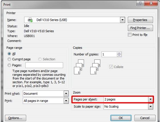
Your printer is likely to have a ‘print booklet’ setting, which you will find after clicking on Print>Properties and looking around. If not, you will have to zoom manually (Figure 2), and to change the order in which your pages are printed, so that they appear correctly when you fold the printed sheets. For an eight-page booklet printed on two sheets of paper (front and back), the correct order is: 8 (back cover), 1 (front cover), 2, 7; 6, 3, 4, 5.

- Figure 5. Zooming in manually
For a more elaborate twelve-page booklet, the correct printing order is: 12 (back cover), 1 (front cover), 2, 11; 10, 3, 4, 9; 8, 5, 6, 7. If you use this format, consider using pages 2 and 11 for recording consent and demographic information respectively. The first sheet of paper can then be detached from the substantive parts of the questionnaire, which you can process separately.
I hope that you found the advice in this post helpful. You might also want to take a look at the following posts on questionnaire design:
If you arrived here while preparing for a student project, I wish you good luck with your work. You may also want to use the social sharing buttons at the end of the post to share this content with other students who might find it useful. If you have any other questions that I might be able to answer, feel free to ask by posting a comment or using this form.

Leave a Reply